Index of Personal Visual Effects: 0004 - Capes & Drapes, Empty or otherwise
More thoughts on elements that occupy my work.
One thing leads to another
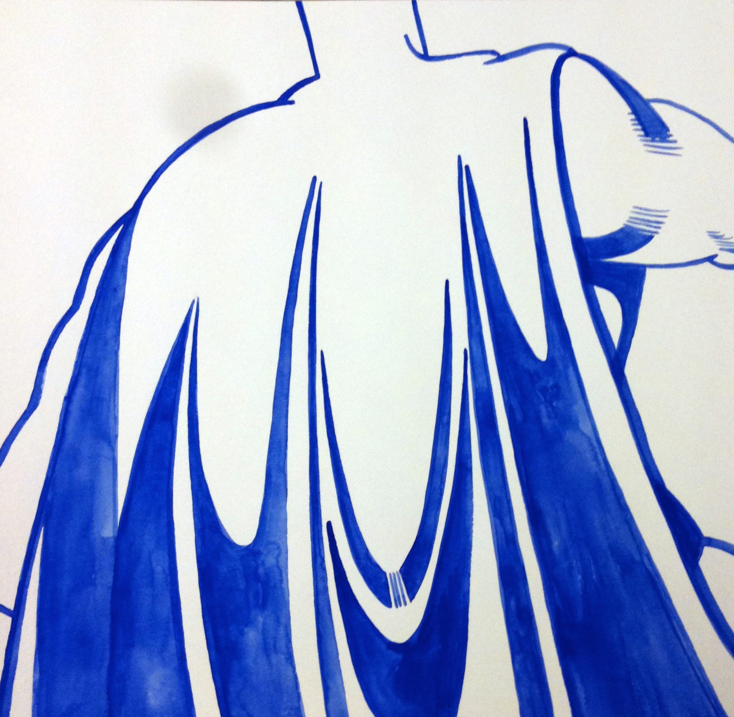
In the last Index post about my work, I unpacked the ghost figure I draw all the time. One of the forking paths the ghost image has taken has turned into another basic, yet recognizable shape. Around the time I started making images of draped fabric and architectural distortions (between 2008-09), a friend of mine lent me his painting studio to use while he was out of the country. Feeling minimalist (lazy actually), and more interested in the opportunity to work in a new space than in conceiving of some big new project, I packed up a few water colors, a stack of paper, and a collection of 1960s Japanese Batman comics for inspiration. I cut a view finder out of a piece of card stock and started sliding it around the pages, looking for small areas in the comic panels for interesting shapes that I could blow up as bigger drawings.
Unsurprisingly, Batman’s cape, being the most prominent shape in almost every panel, dominated my little paper window. After making a few line drawings in watercolor, I realized the cape was more interesting without a body - movement and intention were more ambient implications. I made a handful of these watercolor drawings, and then left them alone for awhile. They were too obviously Batman, and I wasn’t interested in giving something so pop-culture-obvious space in my work. Besides, I told myself I was just experimenting and trying something new in a new space.
Fast forward to 2011 as I was rushing to finish a body of work for my second solo exhibition. I had 15 or so canvases going, and another bigger canvas leaning against the wall. While the smaller canvases were pretty focused, the larger canvas was a catch-all mark making surface. I was intentionally building up the surface by making random marks in between moves on the other surfaces, afixing discarded collage scraps, and wiping excess paint off my brushes. At one point, I cut out a very dumb, and simplistic stencil outline of batman’s cowl as if viewed from behind, and hit the shape with spray paint. Just enough to call it out, but not enough to dominate anything else.
This stiff stencil shape felt off-brand - like one of those knock-off Louis Vitton bags you by on the street in New York. It had no motion, no intention. Just rigid and empty. Now it was interesting. I continued to sketch the shape but kind of kept it out of what I thought was more “serious” work, until a few years later.
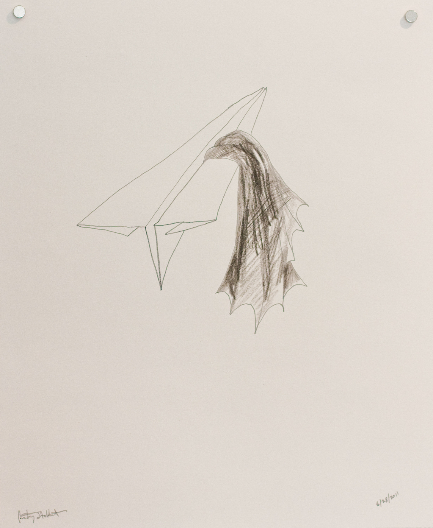
I was putting some other drawings in the show that used the cape (from another set of explorations that aren’t as relevant to this post.) In these drawings the cape was more fluid, and tangled up in some weird origami-like objects, and were much more obviously Batman, but just deflated like an empty bag or as if a 5 year old had drawn them.

A left turn, that will eventually make sense
In my own religious upbringing there was an intentionally narrow visual language for it’s most important theological talking points. Vines. A sun rise. The empty cross. A rolled-away stone from an empty tomb. Many of these images are first introduced to you rendered as coloring pages or as felt cutout objects in Sunday school - the Roman empire’s most notorious murder tool reduced to chunky, accessible lines and soft edges. The empty version of the cross was meant to direct your focus towards “victory over death” rather than show human suffering. The Protestant’s have always had a knack for denying the flesh, even in their theology. The more visceral images of Christ’s nailed body hanging from the cross, or the depiction of stigmata - visible, open wounds marking indicating the crucifixion for the apostles to see and touch - was left to the Catholics and Christian death metal bands.
“Tell all your friends about me.” - Batman
And He said to them, “Go into all the world and preach the gospel to all creation. - Mark 16:15
This lack of acknowledgment of suffering I grew up with eventually rendered the image of the cross as a benign symbol. A brand logo no different than Bank of America or Nike. I was drawn to the intensity of catholic imagery (and yes, Slayer album covers) with their overt depictions of death, hell, and demons. Many of my drawings in high school showed an over-wrought attempt at reclaiming the meaning in the crucifixion for myself by depicting the event in heavy, aggressive line work and a stark use of black and red. Lots of thorny crowns and hands with nails driven through them. I was fascinated, and I wanted it to mean something, but the gap between the visceral depiction of human suffering, and the complete lack of it in my physical life was too wide. The story felt mediated and distant.
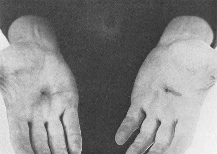
When I was studying art history in college, I wrote a paper on the use of the cross in contemporary art. I found that almost any artist who referenced the cross in their work at all had either no religious upbringing or had grown up Catholic. My favorite of the works I studied for this paper was the piece “Trans-fixed” by Chris Burden.
From the Wikipedia description of the work:
On April 23, 1974, performance artist Chris Burden was crucified shirtless onto the back of a pale blue Volkswagen Beetle.[1] Burden stood on the car's rear bumper and leaned backwards.[2] His attorney hammered two nails through his open palms into the roof. Three other assistants ran the engine and opened the garage door, which opened into an alley called Speedway in Venice, California.[1] The assistants rolled the car out of the garage, where it ran while stationary for two minutes with the engine at full throttle.[2] Fifteen of his friends were there, having been invited but not briefed on what to expect.[1]
Burden later displayed relics from the performance, including a plaque alongside the two nails.

Burden was not religious. This new way of depicting this event really charged my mind. It was loaded with political and economic commentary beyond the church. It was much more recent. It involved a car - and iconic symbol of freedom and personal identity. It was also, obviously, intensely physical because he actually put nails through his hands. Where the bible had felt like distant ancient stories for your soul’s imagination, a living artist put his money where his mouth was in my own century.

The Protestant cross is missing a body. The cape is absent its wearer. The mask is missing its hidden identity beneath. The viewer is allowed to fill in the space and make it stand for whatever suits their agenda.
Religious symbols possess a great deal of expectation. History is rife with violent or beautiful images adapted for something opposite its origin. The swastika has deep roots in indigenous and Buddhist cultures, but the Nazi party changed its associations forever. The Roman cross was a tool used to murder criminals or enemies of the state. Bodies were left to hang in public spaces and die slowly in front of friends, families, and neighbors. Catholics keep Jesus’s body on the cross to remind followers of his suffering on our behalf. Protestants remove the body to remind us of Christ’s resurrection and victory over death. (The empty tomb never mudered anyone and is less striking an image and so it gets less representation outside Sunday school.)
I’m not interested in Batman as a pop commercial icon. But I am interested in pop manifestations of how we conceal ourselves - our doubt, our beliefs, the source of our certainty or power, our identities in order to protect ourselves - and what may be left when the human part is removed. The cross is a pop icon with or without the body of Christ. Worn by good guys and bad guys in films, comics, and rock music videos. In Batman stories, Bruce Wayne took on the image of the bat as a symbol that separated himself - the wearer - from the idea the image created for others. A sacrifice of the self made in order to push forward an idea that functions beyond spoken language.
At this point the bat-cape image feels as basic as a triangle or circle in my drawings. It morphs between having fluid motion, as if animted by a physical presence, and being a stiff, logo-like shape that looks like it was drawn with my eyes closed. It’s kind of silly and pretty “on the nose.” Either way it is a placeholder for something else. Whether that something is missing or present for the viewer is not up to me.

Bonus round
Shop updates
Thanks to everyone who’s visited my new online shop. I’ve added three new small prints since my last post and I’d love to know what you think. These are affordable and sized to fit an 8”x10” frame, plus free shipping is still in effect (for a limited time.)
Upcoming Free Static performance
Finally, I’ve got an upcoming performance this coming Saturday, April 29th, in Eugene, Oregon. Free Static will be performing alongside several other experimental music acts as part of a show myself and a couple other friends are hosting called SENSORAMA. It will feature live video mixing and projections by Josiah Martens. It’s gonna be bonkers. 7:30pm. All ages. $10 (sliding scale). 575 Garfield.
Here I made you this poster to make it easy for you to remember the details.


